INTRODUCTION
THE TEAM
Our team was made up of 5 members including myself who are all juniors studying ETBD. Being students within the ETBD department we all brought a different set of individual skills. These skills allowed us to provide different perspectives and skills when collaborating on tasks for the project. As a group, we focused heavily on teamwork when ideating for different stages throughout the process.
THE PROBLEM
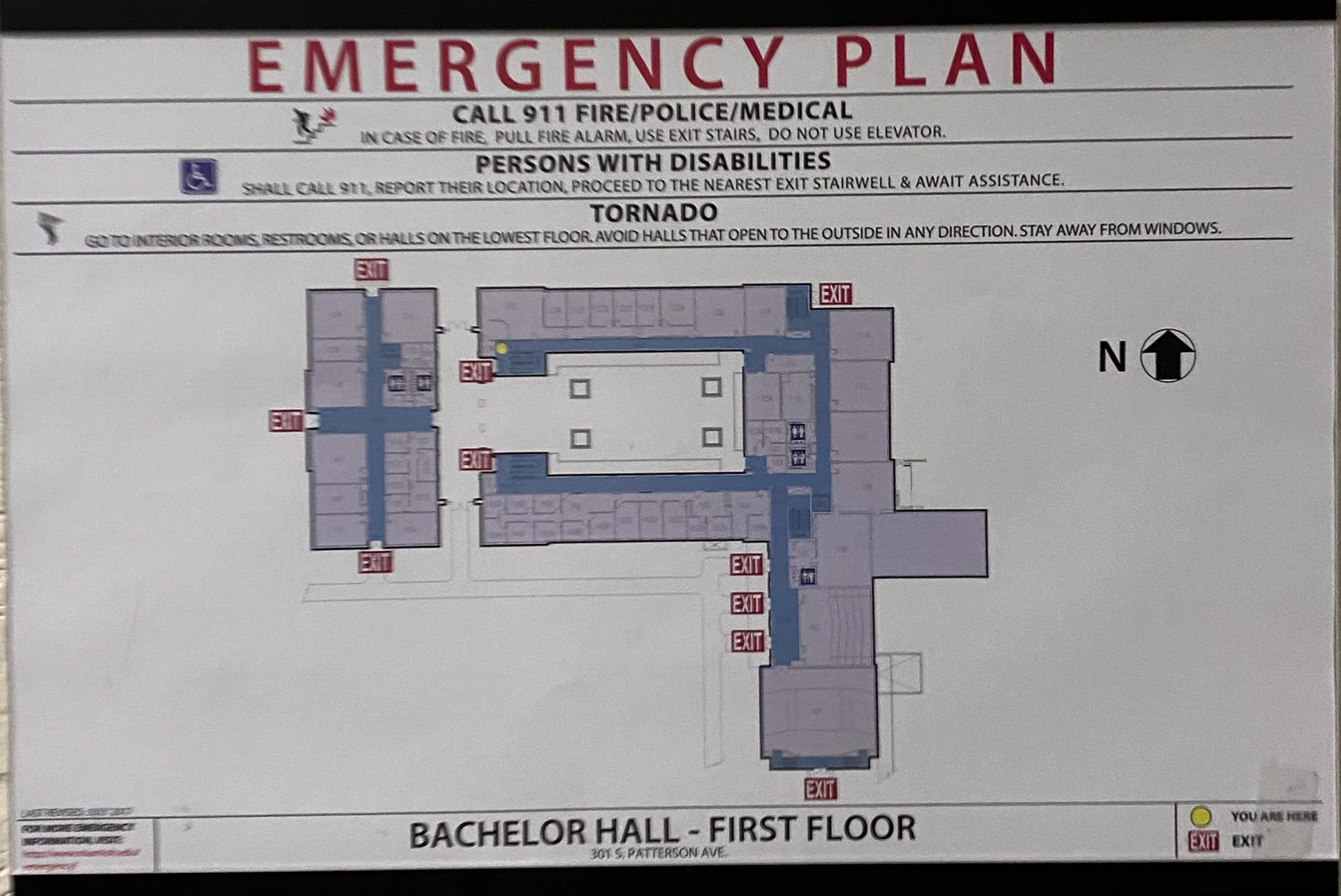
Miami's campus is certainly beautiful and all of the buildings look attractive from the outside, but where we find our main problem for this project actually lies within the walls of these buildings. Bachelor Hall is one of the many staple buildings on Miami's campus as it is 43 years old and home to the English and Math departments. Most students across all majors visit Bachelor Hall at least once during their time at the University. The large majority of students who have visited the building could all attest to the fact that the layout and navigation are nothing short of confusing. While the building may look appealing from the outside, visitors are met with puzzlement as soon as they step foot through the doors. The main contributors to this puzzlement are a lack of signage, similar-looking hallways and classrooms throughout the building, disconnected hallways on the first floor leading you to walk outside again if entering through the front door, poor placement of stairs and elevators, and many more. Overall, this poor layout and navigation leave students, staff, and visitors stressed and confused.

THE RESEARCH
PRE RESEARCH
To better understand the problem at hand, pre-research was conducted. The main focuses with pre-research were to find scholarly sources to better understand navigation and wayfinding along with exploring Bachelor to experience the navigational challenges firsthand.
One scholarly source found, explains that “Wayfinding is the art of using landmarks, signage, pathways, and environmental cues to help first-time visitors navigate and experience a site without confusion. These cues should be well planned, seamlessly connected, and aesthetically pleasing so visitors have a positive first impression highlighted by a sense of security, comfort, and well-being” From this I inferred that a positive wayfinding experience checks all of these boxes and makes it easy for the visitors to navigate around the desired space. If a wayfinding experience is missing some of these elements it can become confusing. The visitor is then left feeling uncomfortable and lacks security within the space.
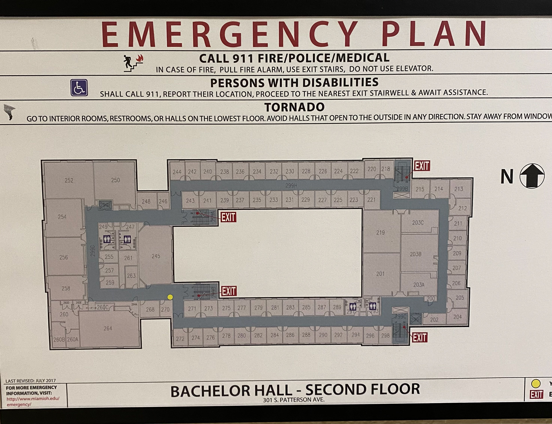
After exploring Bachelor Hall on my own to better understand the layout of the building, I found that it replicated the experience of going through a maze. We made it up to the second floor after finding the weird gap between the building on the third floor and didn’t know where we were going. When we attempted to leave the building we had to retrace our steps and go back out the way we came in. It felt as though I had no sense of direction within the building and could easily get lost. Additionally, When walking through the halls there was incredibly minimal signage to be found. The only signage I noticed was present right outside of the rooms such as the room numbers and bathroom signs. There are no hanging or floor signage present and there was also a lack of signage outside the building where the secondary entrances are present. Finally, there were a few floor plan maps present around the hallways of the building. This was primarily the only directional signage present. One thing that is very helpful with the maps is the yellow marker indicating where you are in the building. These were the only resources helpful in understanding where we were traveling within the building.

INTERVIEWS
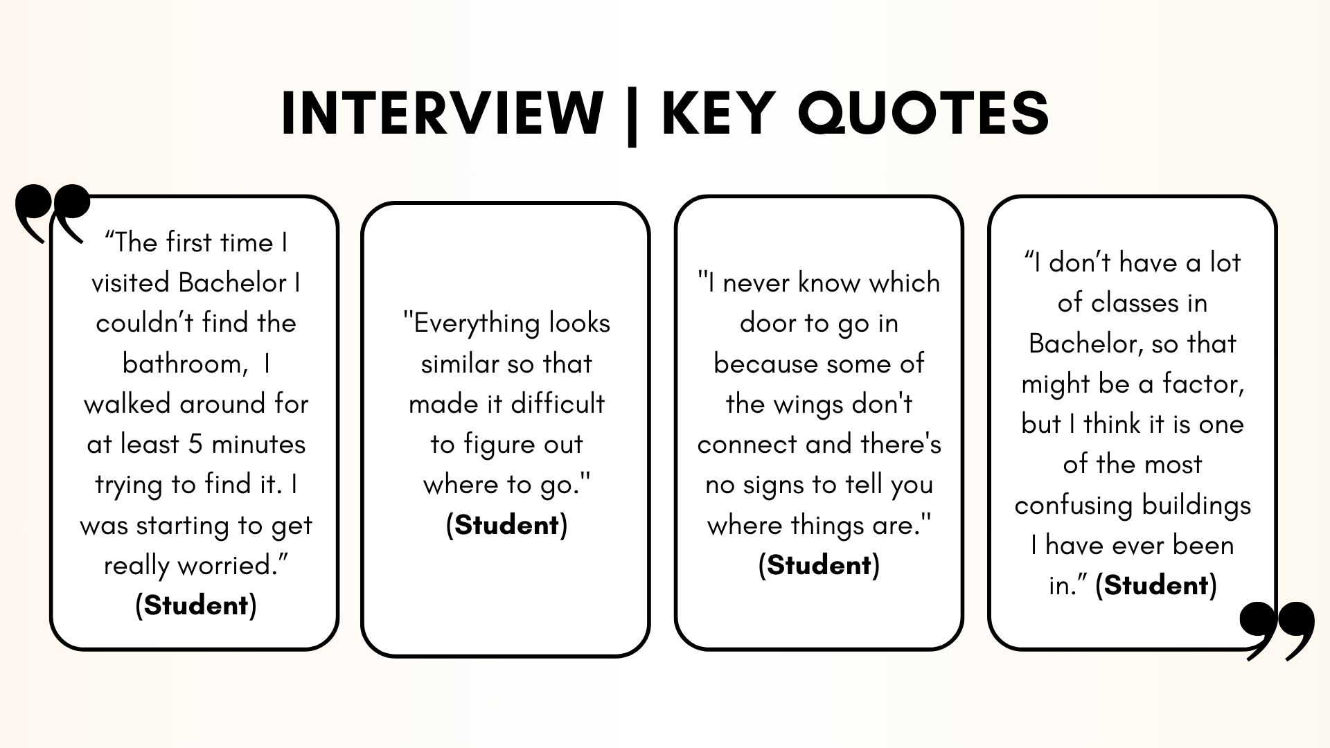
All group members conducted interviews with each member completing 2-3 individually. Interviewees were asked a series of questions mainly related to navigation around campus buildings and thoughts on Bachelor Hall.

SURVEY
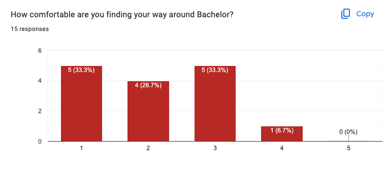
As a group, we created a comprehensive survey that everyone was in charge of sending out to at least 3 people. We broke down the survey questions into 3 categories Personal Information, General Navigation, and Bachelor Navigation. The personal information section just collected general data regarding their year and major. The general navigation section was tailored towards discovering habits participants followed when navigating around campus. Finally, in the Bachelor navigation section, we were able to uncover information about participant's experiences navigating through the building. In total, we received 17 responses and were able to gain valuable insights into our target user group. The results to the left, go to show that the majority of participants didn't feel very comfortable navigating around the building and when they were navigating most of them chose to just wander around in the hopes of finding their destination.
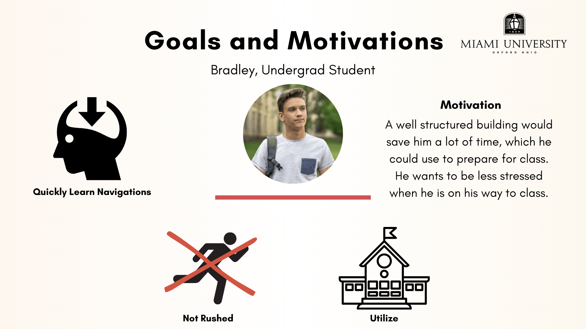
USER GROUPS
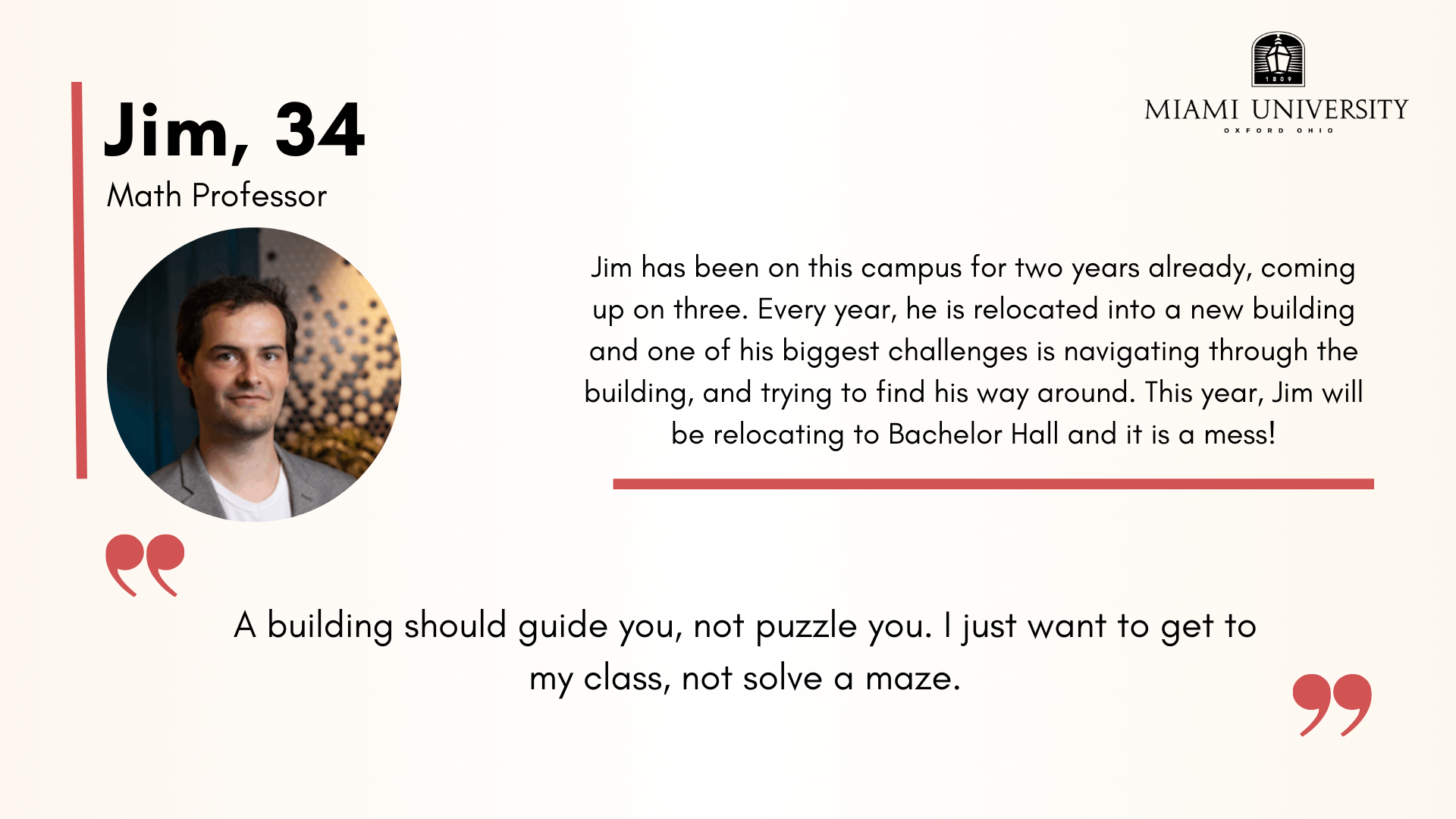
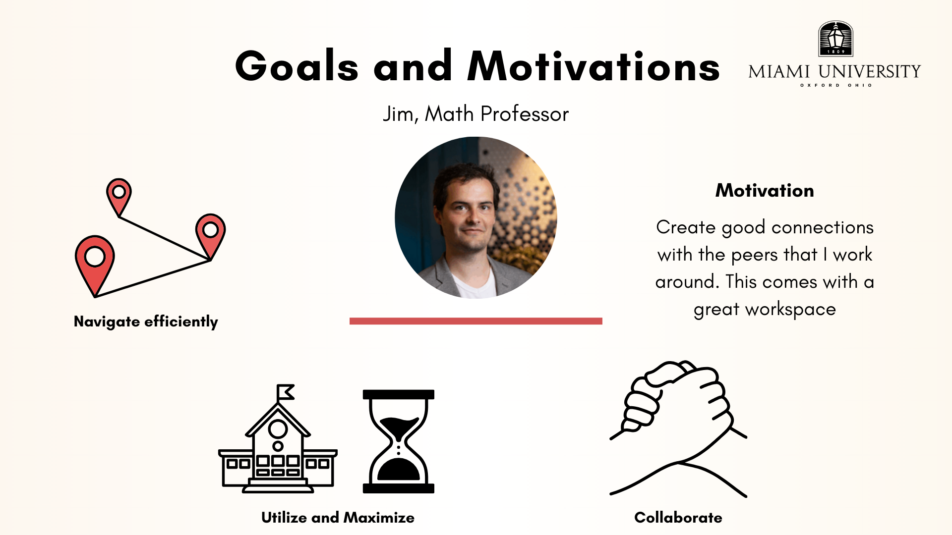
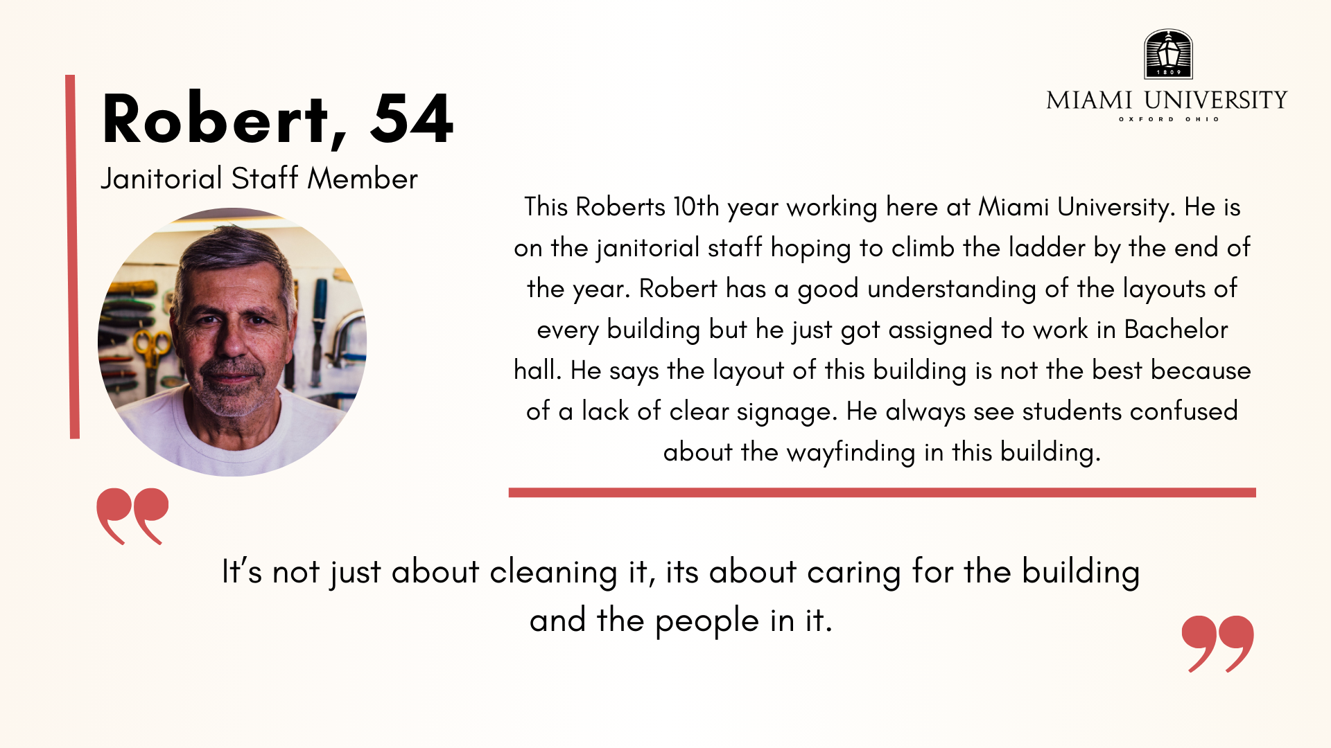
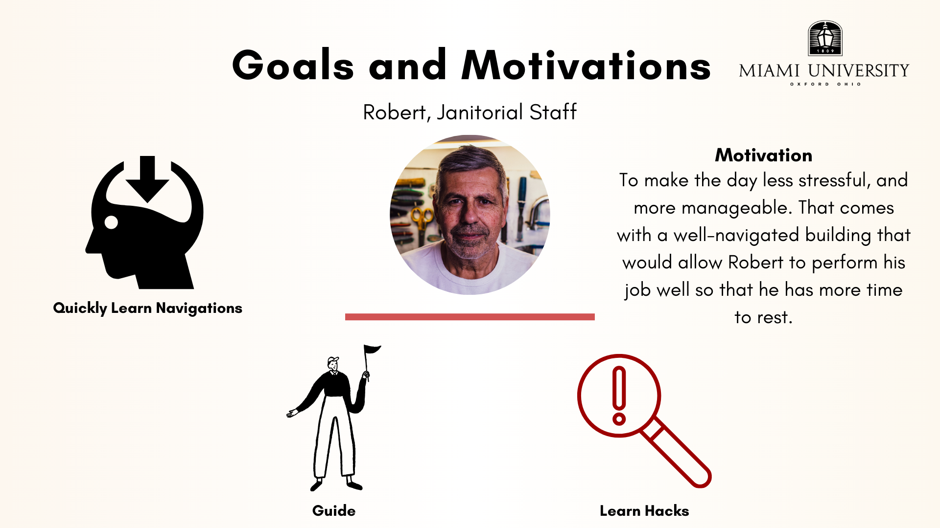
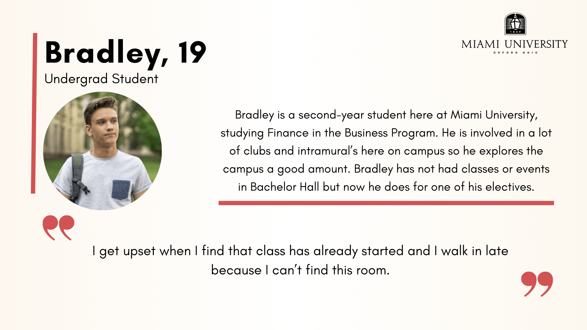
Based on our research we were able to create three personas to represent three user groups we identified. Our three user groups were represented by Jim, a professor, Robert, a janitor, and Bradley, a student.
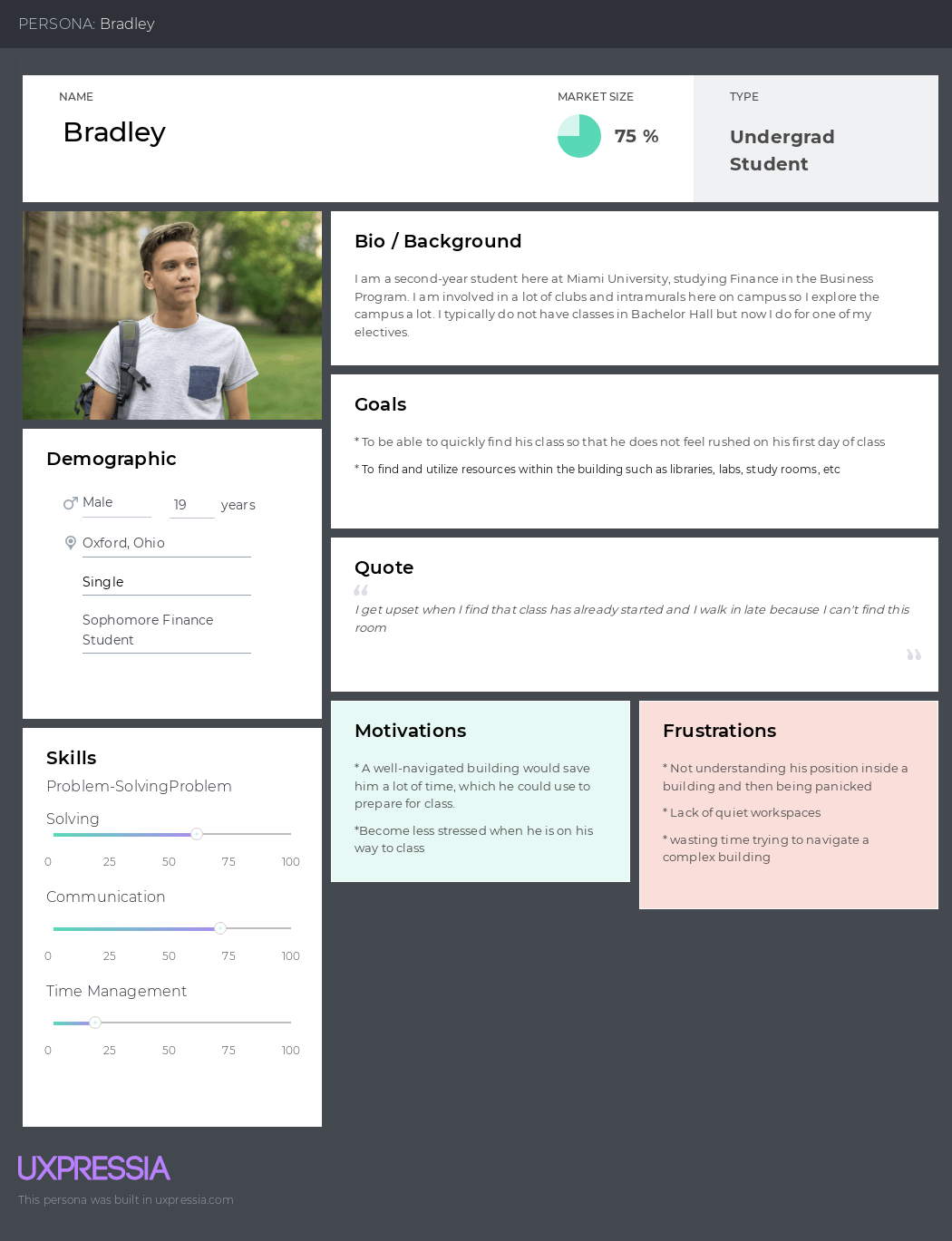
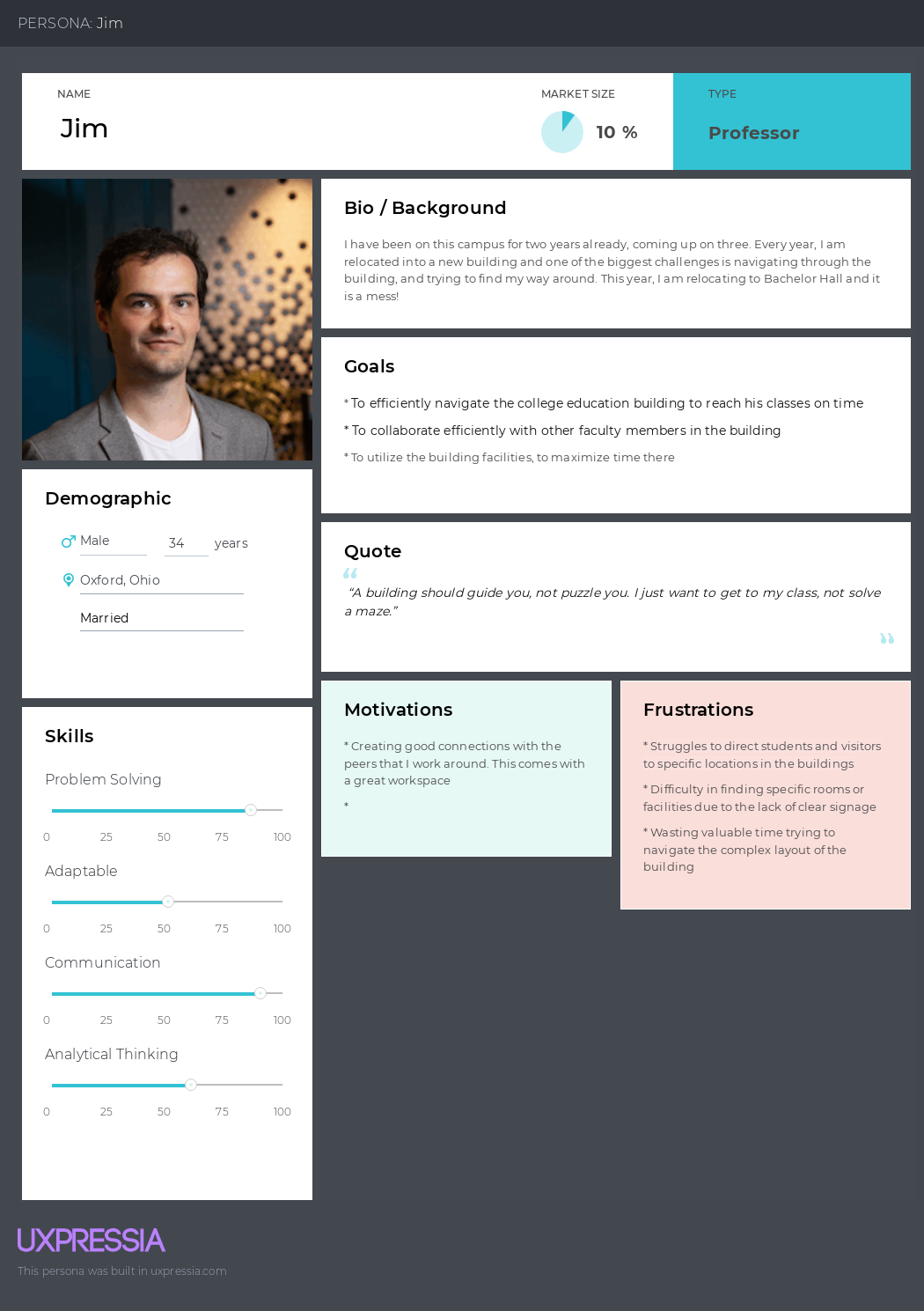
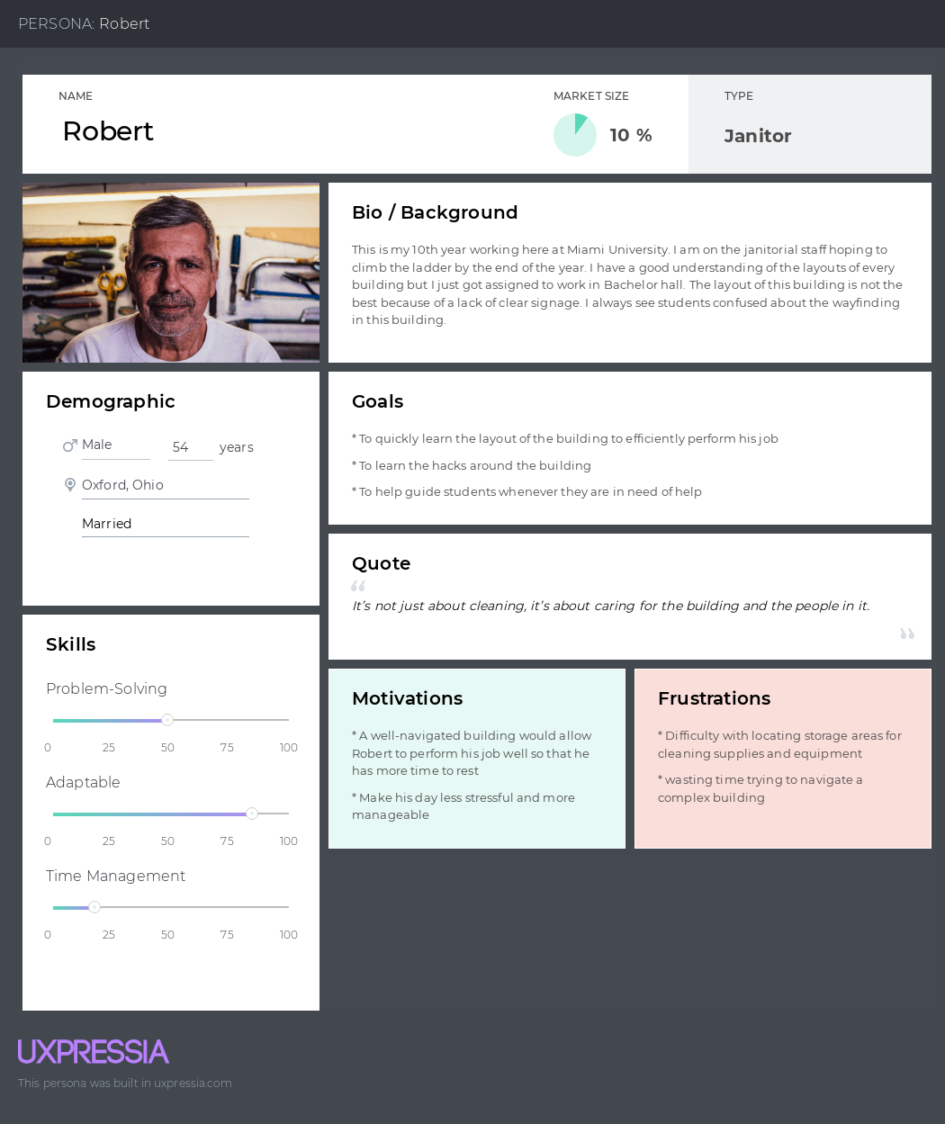
Once our personas were created, we decided to break them down further for our audience to be able to better understand them when presenting. Found below are images containing basic information about each of our user groups such as their background, goals and motivations, and a quote.
PROBLEM STATEMENTS
POV STATEMENTS
Professors located in Bachelor need to have the confidence to navigate the building and know where things are because students and visitors will use professors as a resource when needing to find a specific location in Bachelor.
Janitorial staff assigned to Bachelor Hall need a strong understanding of building layout because knowing this will allow them to complete their tasks efficiently.
Students with majors outside of Bachelor Hall need a general sense of navigation within the building to be able to locate classrooms, bathrooms, stairwells, etc. because it will contribute to gaining the best experience for their education and well-being.
HOW MIGHT WE STATEMENT
How might we create an intuitive and efficient navigation system within Bachelor Hall that enhances the confidence of Professors, enables janitorial staff to complete their tasks efficiently, and improves the overall experience of students and visitors?
ETHNOGRAPHIC VIDEO
One of my main focuses over the course of the project was shooting and editing our ethnographic video. The video is intended to show the navigation experience of Bachelor Hall through the eyes of an average student. The student in the video had never before visited the building and was given a random classroom to locate. Throughout the video you see his process, reflections, and thoughts encountered whilst underway with the navigation. The video provides insights as to what the problem is in the user group's shoes and gives a glimpse of what the navigation of Bachelor looks like for them.
DESIGN PROCESS
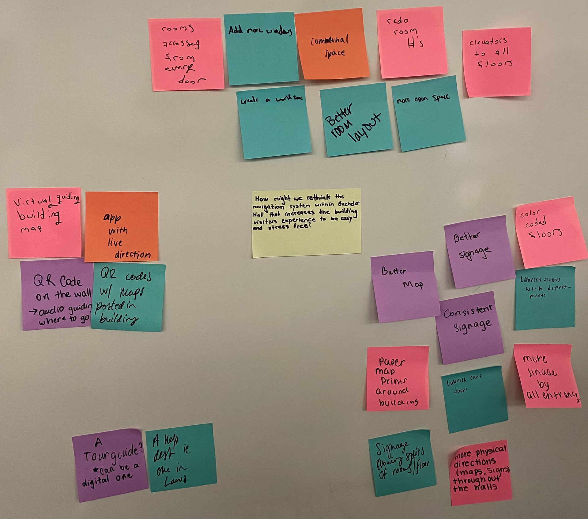
IDEATION/BRAINSTORMING
Once we thoroughly understood our problem the next step was to begin ideating a solution. We revisited out how might we statement we had come up with and went from there to begin our brainstorming. The approach we took to get the brainstorming started was having all of the members of the group write down quickly ideated solutions on sticky notes. From there we gathered all of the notes and grouped them into 4 categories based on the similarities they had. This process is shown to the right.
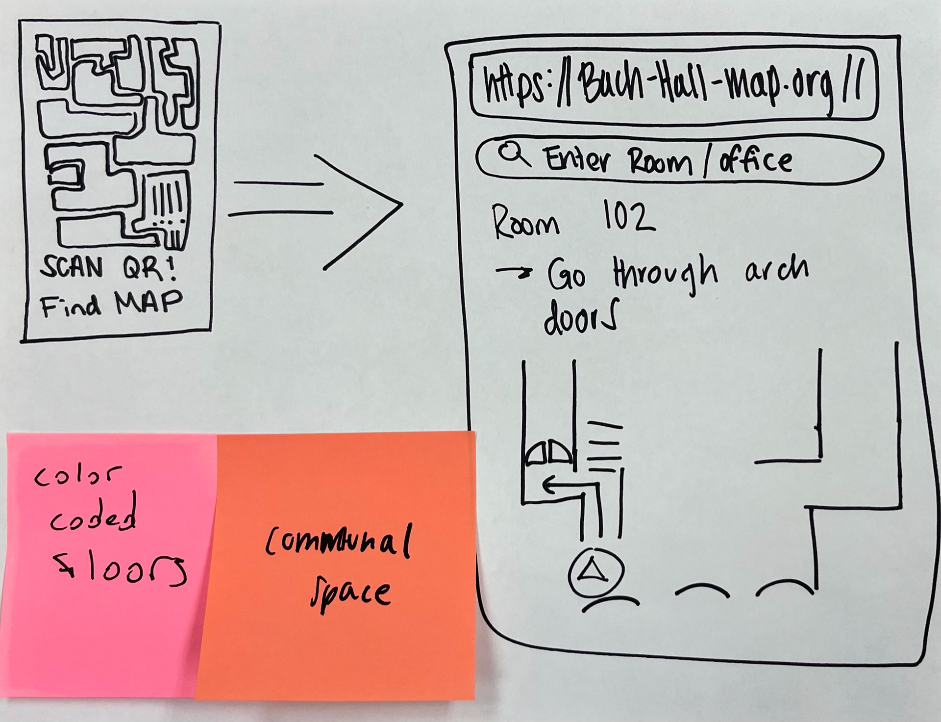
WIREFRAME
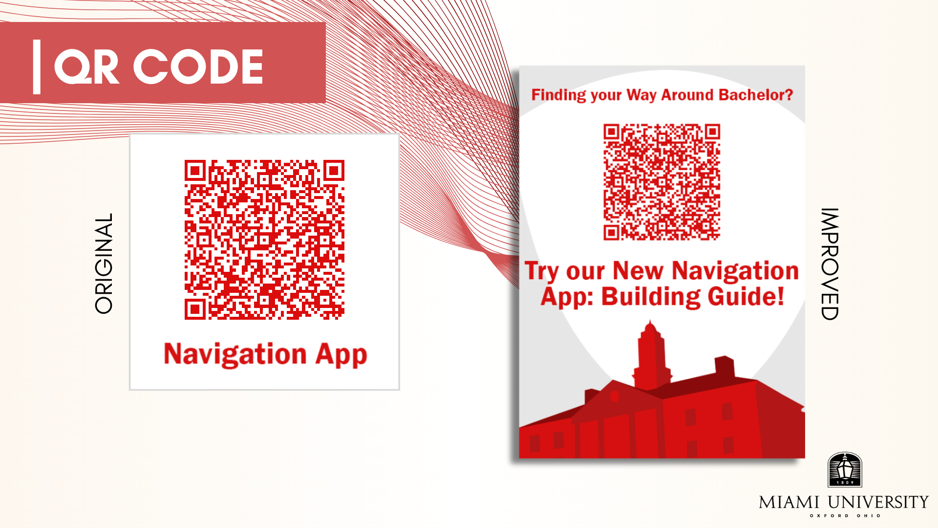
Based on the 4 categories we had identified in the ideation process we decided the most feasible solution was the QR code/navigational app route. This allowed us to deliver a solution that did not physically change the space at all but instead provided visitors with a resource to combat their current navigational struggles within the given space. We mocked up a quick wireframe sketch containing a web-based navigational application that was accessed by a QR Code, which we also mocked up. The wireframe discussed is shown on the left.
THE SOLUTION
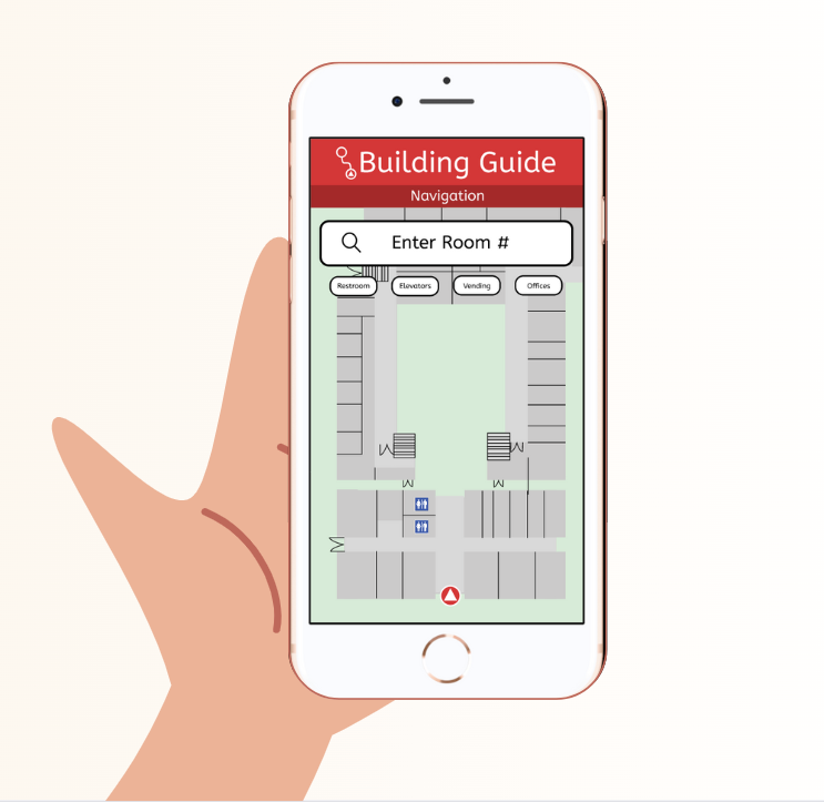
PROTOTYPE
Once we had our wireframe completed the next step was to move it to a digital format and add more detail to create a prototype. We decided to utilize Figma to create our prototype in which we drew inspiration from Apple and Google Maps. Since these two navigational apps are utilized by most within our user group we figured it would be best to create our interface with similar features and layouts. I played a big part in creating the prototype by producing all of the icons, formatting the text, and laying out the guiding arrows. Through the application, users would be able to enter a room number, professor name, or needed destination (vending machines, bathrooms, etc.) and then be guided to their location with directional arrows and text. The first Prototype we created is embedded below for easy interaction.
USABILITY TESTING
PARTICIPANTS
During our testing process, we engaged four participants with varying experiences within Bachelor Hall, ranging from never being there to a student who attended three classes within the building. All participants started at the front doors of Bachelor, three of whom had access to the QR code and one without access. Tests were conducted at different times but during non-transition periods to ensure minimal distractions.
TASKS
We conducted a simulation comparing participants navigating to Room 102 with and without the application. Our three main components for ensuring success were identifying and successfully scanning the QR code, ease of navigation within the application (touch points and inclusivity), and successfully finding Room 102 using the fastest route possible.
INSIGHTS & IMPROVEMENTS
QR CODE INSIGHTS
The QR code was posted on the inside doors of the entrance. Only 1 out of 3 participants was able to successfully identify the QR code as something they should scan. When asked why they did not scan it, the other two participants responded that they do not stop to read flyers and try not to linger at entrance doors to move out of the way. Realizing that even during non-transitional times, students feel they have to stay out of people's way, resulting in few students stopping at the entrance to scan a QR code. To ensure accuracy, we prompted any participant who missed the QR code to scan it before leaving the front of the building.
QR CODE IMPROVEMENTS
Our prototype always had one thing certain, it had to be in front of you and had to be a big QR code to be noticeable. Our original plan consisted of putting it on the front door, similar to how Miami often has stickers on its windows. You would walk up to the front door, see the QR code on the window, and it would help you navigate the building. Unfortunately, it was quickly ignored and didn’t provide enough information to intrigue the passerby. That is when we revised our plan and positioning. Instead, it would be even bigger, with a more interesting/modern design, and on a standing display in the middle of the hallway where all entrances would intersect. This would not only allow those who enter from the front door to notice but those who enter from the arches.
APPLICATION USAGE INSIGHTS
When navigating the application, some images did not load quickly enough, making the application seem glitchy and slow to update. This aligns with our concern about automatic loading based on the device's location. Having constant real-time location updates would ease navigation. Participants noted the application seemed a bit jumpy due to the lack of constant updating and the delayed loading of pictures. All three participants with access to the application found real-time location advantageous, suggesting it as an improvement achievable on an actual coded platform with access to real-time location information.
Participants using the web-based application also observed screen dimension issues, particularly on mobile devices. One participant, representing 33% of Bachelor visitors, expressed a wish to not continually look at their phone and hoped for audio direction to prevent constant screen viewing. This improvement could be implemented on a coded platform other than Figma.
APPLICATION USAGE IMPROVEMENTS
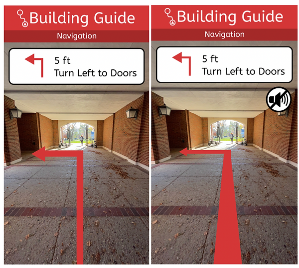
Our primary change to aid navigation within the app would be location-based refreshing, similar to Google or Apple Maps when in navigation mode. Currently, our program operates similarly to Google Maps Street View, requiring tapping to change perspective. Our goal is to create real-time updating of the in-person view similar to the location icon on Google and Apple Maps, displaying the device's compass direction and surroundings during movement. Additionally, incorporating live audio directions, similar to Google Maps and Apple Maps, would allow participants not to be forced to look at their phones, enabling users to observe their surroundings.
To offer a better sense of perspective, we revised the arrows to appear three-dimensional. The original prototype on the left and the revised version on the right display a perspective arrow and the option to mute and turn on sound navigation.
NAVIGATION TIMING INSIGHTS
Although confusion lingered in all participants, it was evident that the participant without the application had a harder time locating the classroom. This participant took 10 minutes to find the classroom, while those using the application took only 3-4 minutes, reducing the time by around 60% to find Room 102. This evidence suggests that the application would enhance overall efficiency and decrease confusion during wayfinding through Bachelor.
Not only did we find these insights from our usability testing but also from our own navigation comparison as a group. When I filmed our ethnographic video it took significantly longer for the student to navigate through the building without assistance from the app. For our final presentation, I came up with the idea to shoot a point of view of someone using our prototype in real-time. This would allow viewers to get a real feel for what utilizing the application would be like. Below is the time comparison along with the point-of-view video.
FINAL PROTOTYPE
Once usability testing was complete we were able to go back in and tweak a few elements to come up with our finalized prototype. Our main edits consisted of changing the navigational arrow so that it was a perspective arrow and adding the sound icon to choose whether or not to have directions spoken to you.
SUMMARY
Overall I feel like this project was a great learning experience. I had not yet had the opportunity to practice experience design, so this was my first taste of what that looks like. During this project, I took on the role of shooting and editing videos which helped to sharpen my skills in these areas. I also played a part in ideating our solution and creating the prototypes. Working with my team on these things was a good experience to understand how to work effectively with and build on each other's ideas. My involvement in usability testing played a role in revealing essential insights, particularly in fully understanding the user group's needs and wants. Recognizing the value of adapting to challenges and using them as learning moments was key in developing our final products. I would have to say that this project strengthened my skills in many areas the most notable being UX design, video editing, research, problem-solving, and empathizing with users to understand how design significantly impacts day-to-day life.
SOURCES
“Bachelor Hall (Miami University).” Wikipedia, 2023, https://en.wikipedia.org/wiki/Bachelor_Hall_(Miami_University). Accessed 13 December 2023.
Engati. “Experience design (XD) | Engati.” Engati chatbot, 2021, https://www.engati.com/glossary/experience-design. Accessed 13 December 2023.
Marquard, Michael. “The Real Impact of Wayfinding.” The LA Group, 30 September 2016, https://www.thelagroup.com/2016/09/30/real-impact-wayfinding/. Accessed 13 December 2023.